Let's be honest: in the world of online shopping, your product page is your salesperson, your storefront, and your handshake all rolled into one. Unlike a physical store where a customer can pick up a phone, feel its weight, and see its color under natural light, an eCommerce store relies entirely on pixels and text to make a sale.
If your product pages are cluttered, confusing, or lacking in detail, customers will leave. They will go to a competitor who simply did a better job of showing the product. But if you get it right? You create trust, excitement, and urgency.
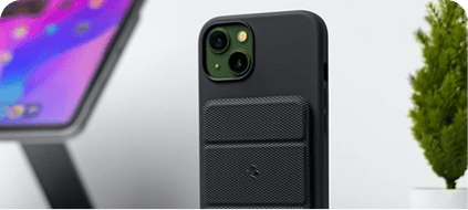
Today, we are going to break down exactly how to build product pages that convert. And yes, using high-quality images like the one above (showcasing multiple colors and angles) is step number one.
Why a Bad Product Page Costs You Money
Imagine this: A customer lands on your store. They see a picture of a smartphone. They like the color. They click.
But then... they are disappointed.
The image is blurry.
There is only one photo.
The description says "Great phone."
The shipping cost is hidden until checkout.
That customer is gone in 3 seconds. You lost a sale, not because your product was bad, but because your presentation was bad.
According to a study by Nielsen Norman Group, users spend an average of 5.59 seconds looking at a product page before deciding to scroll or leave. You have less than 6 seconds to make an impact.
Here is the roadmap to fixing that.
1. The Power of High-Quality Product Photography
Let's start with the most obvious element, and the one your image perfectly illustrates.
Multiple Angles, Multiple Colors
Notice the image of the smartphones. They are not just lying flat. They are fanned out, showing four different colors: classic black, sleek silver, soft pink, and bright blue. This visual variety immediately helps the customer imagine which one fits their personality.
Your Action Plan:
Shoot on a clean background: Use solid colors like grey, white, or black to make the product pop.
Show all variants: If you sell a phone case in 7 colors, show all 7.
Zoom capability: Allow customers to zoom in on the camera lens, the buttons, or the texture of the material.
Lifestyle shots: Don't just show the product; show it in someone's hand, on a desk, or in a real-world setting.
The image we have here is perfect for a "Shop All Colors" banner or a gallery thumbnail.
2. Crafting the Perfect Product Title
Your title is the first thing a shopper reads. It must be descriptive, clear, and keyword-rich for search engines (SEO).
Bad Title: "Phone"
Good Title: "Samsung Galaxy S20 FE 5G - 128GB - Cloud Lavender - Unlocked"
Why it works:
Brand: Samsung
Model: Galaxy S20 FE
Key Feature: 5G
Capacity: 128GB
Color: Cloud Lavender
Condition: Unlocked
Your title answers the basic question: What is this exactly?
3. Bullet Points: The "Read Me" Section
Most customers do not read long paragraphs. They scan. You need bullet points.
Instead of writing:
"This phone has a great camera and a long battery life which is perfect for people who take a lot of photos and travel a lot."
Write this:
✅ 30X Space Zoom: Capture detailed photos from across the room.
✅ 4500mAh Battery: Lasts up to 2 full days on a single charge.
✅ IP68 Water Resistant: Survives splashes, rain, and accidental drops in water.
Bullet points are scannable. They give the customer the "quick facts" they need to make a decision.
4. The Description: Tell a Story, Not a Manual
Once you have the bullet points, you can write a longer description. But don't make it boring. Make it emotional.
Let's imagine you are selling the pink phone in the image above.
Boring Description:
"This is a pink phone with 128GB storage. It has a 6.5 inch screen."
Engaging Description:
*"Stand out from the crowd with the Cloud Lavender Galaxy S20 FE. Designed for those who love bold color without compromising on performance, this phone features a stunning 6.5-inch Infinity-O Display that makes every video and photo look cinematic. Whether you are streaming your favorite show or recording a vlog in 4K, the Cloud Lavender finish reflects your unique style. It is your perfect everyday companion."*
Tip: Use sensory words (sleek, smooth, vibrant, crisp) and focus on the benefit (what the user gets) rather than just the feature (what the phone has).
5. Pricing, Social Proof, and Call-to-Action (CTA)
You have the image. You have the description. Now you need to close the deal.
Pricing Strategy:
Be transparent. No hidden fees.
If you have a discount, show the original price crossed out next to the sale price. This creates a sense of urgency.
Social Proof:
Add customer reviews below the product description.
"5,000+ satisfied customers" is a powerful trust signal.
Show a photo of a real customer using the phone. This relates directly to the image of the phones on the table—it moves the product from "stock photo" to "real life."
The Call-to-Action:
The "Add to Cart" button should be large, bold, and a contrasting color (e.g., bright orange on a grey background).
Don't write "Submit" or "Buy."
Write "Add to Cart" or "Order Now - Free Shipping."
6. Mobile Optimization is Non-Negotiable
If you look at the image in this blog, it is visually stunning on a desktop or a phone screen. That is how your product page must look on every device.
Over 60% of eCommerce traffic comes from mobile phones.
If your images take too long to load, people leave.
If the "Add to Cart" button is hidden below the fold, people leave.
If the text is too small to read, people leave.
Action Step: Test your product page on your own smartphone. If you have to pinch-to-zoom to read the price, you are losing money.
7. The "Add to Cart" of the Future: Color Swatches
Notice the image of the four phones again. It shows the options clearly.
In your store, you should use color swatches. Don't force a customer to click "Black" and then see a black image load. Allow them to hover over a tiny dot of pink and have the main image instantly switch to the pink phone.
This creates a fun, interactive experience that mimics holding the phone in your hand. It works particularly well for fashion, accessories, and electronics.
Conclusion: Your Sales Start on the Page
If you take away only one thing from this blog, let it be this: The customer buys the experience, not just the product.
The four smartphones in the image are beautiful objects. But without a well-structured product page, they are just pretty pictures. Add clear titles, scannable bullet points, emotional descriptions, pricing transparency, and real reviews, and you transform those beautiful pictures into a profitable business.
Optimize your product pages this week. Watch your conversion rate go up, and your cart abandonment go down.